The Wooster
Branding • Naming • Signage
Multi-Family Housing • Apartments
(©2026)
CHALLENGE
The multi-family housing market in Chicago's suburbs runs on a predictable formula. "Luxury" gets used so freely it's stopped meaning anything. The branding tends to be forgettable — stock photography of granite countertops, generic sans-serif wordmarks, and a marketing voice that sounds like a real estate portfolio, not a place someone actually wants to live.
The Wooster was a new construction project in the Chain O' Lakes region of Lake County — a community being built from scratch with a real, specific promise: urban access and suburban ease in the same address. Metra access to Chicago. A lake view out the window. Quality that continues after move-in day.
But before a single unit could be leased, the property needed an identity — a name, a voice, a visual language, and a brand story compelling enough to attract the right residents and establish The Wooster as somewhere worth moving to. We were brought in before the building was finished. Everything needed to be created from the ground up.

APPROACH
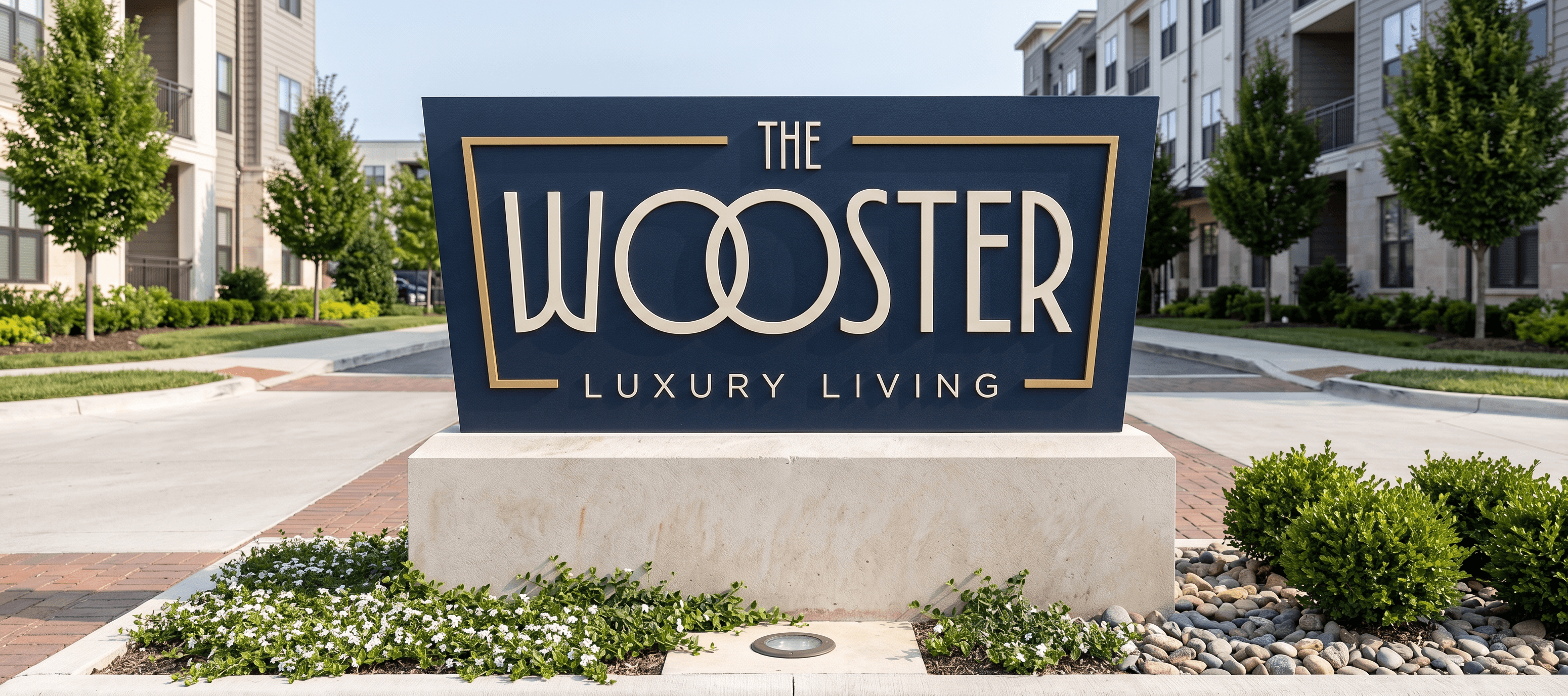
We started with the name. The property sits on the edge of a lake — and naming it after that lake gave the address an immediate sense of place. "The Wooster" carries a certain weight: distinguished without being stuffy, while still being geo-specific. It sounds like somewhere worth talking about.
From there, the brand's central truth became its north star. This wasn't a property where residents had to choose between the energy of the city and the quiet of the suburbs — it was the rare address where they get both. That tension, resolved, became the tagline: Experience Luxury Without the Noise.
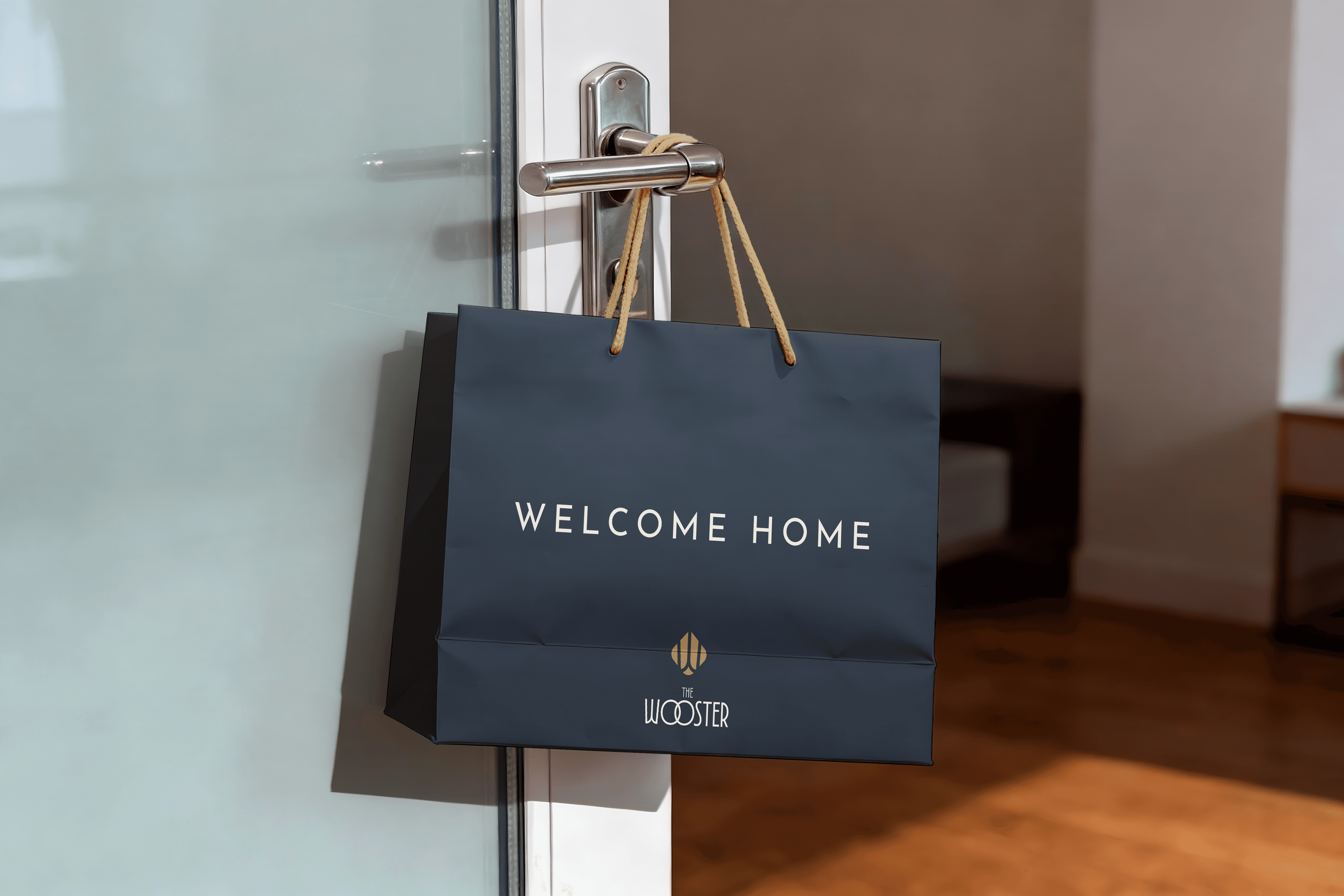
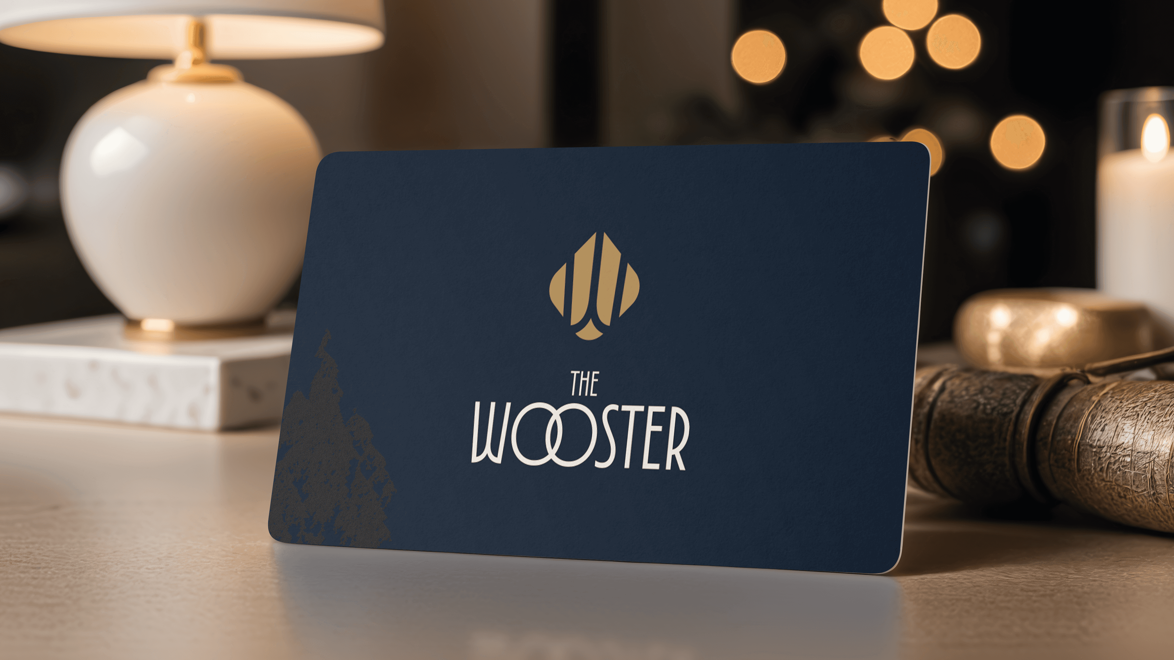
The visual identity was built to match that promise. We anchored the palette in Midnight Indigo — confident, sophisticated, and ownable — then warmed it with Lamplight, a burnished gold that signals craftsmanship without announcing itself. The system reads premium without being loud, which was the whole point. The custom wordmark carries a detail worth noticing: the interlocked O's quietly nod to the Chain O' Lakes location while reinforcing the brand's connected personality. The architectural shield gives the brand a sense of permanence, like it's always belonged there.
Beyond the logo, we developed the complete brand system — purpose, mission, vision, and brand values; brand personality and voice guidelines; messaging examples and tagline; typography hierarchy; color distribution; graphic element usage; photography direction; and social media examples. We wrote all of the brand copy from scratch. We designed the monument signs that greet residents and visitors at the property. And we worked alongside the web development team, providing the creative assets and direction to bring thewooster.com to life.
OUTCOME
The Wooster is currently under construction, with leasing underway ahead of opening. The brand is already out in the world — open house events, floor plan promotions, social content — communicating the right message to the right people before a single resident has moved in.
What we delivered wasn't just a logo. It was the invisible architecture behind everything The Wooster says and does: a system the developer and leasing team can deploy consistently for years, across every touchpoint, without losing the thread. When the doors open, the brand will look like it's always been there.